Tutorial for neat Time Series Plot with Matplotlib
- 6 mins考虑到大家总是有画图的需求,而时间序列数据,处理不好的话画出来的图就会不好看。自己属于完美主义者,觉得图不好看就会很别扭,摸索了半天,差不多可以画出如下效果: 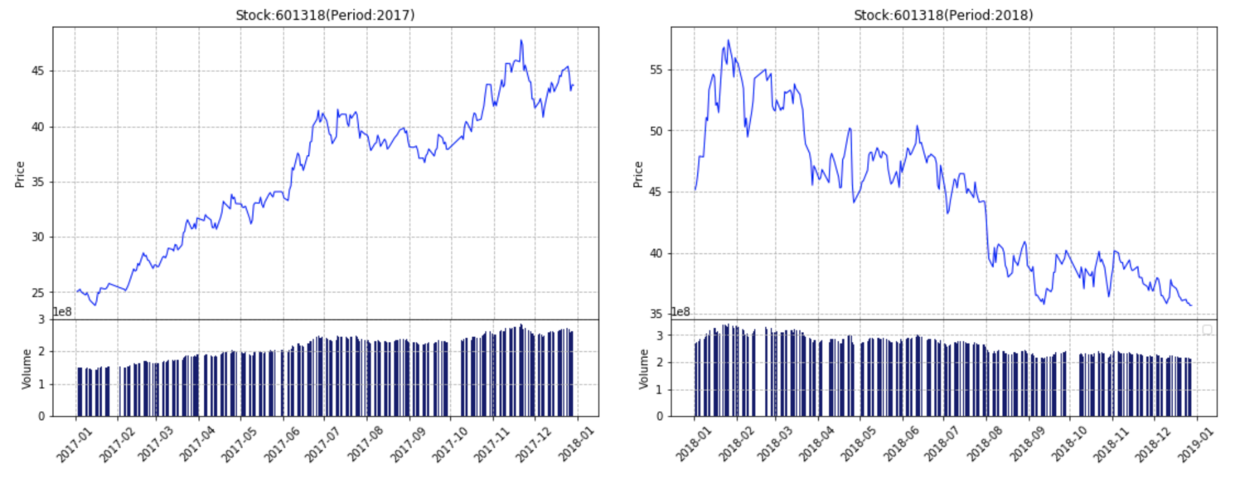
Preface
在开始之前,简单说一下你可以从这篇文章里看到什么:
- 处理时间序列数据
- 上下分布式的图
Time Series
我的df是两级index,第一级是股票code,第二级是日期
data_input = pd.read_csv('data_input.csv',
                   delimiter=',',
                   converters={'Stkcd':str})
data_input=data_input.set_index(['Stkcd','Trddt'])
挑一个股票看看就是这样的数据,我的dataframe长这样(苍天我不知道图片如何变小): 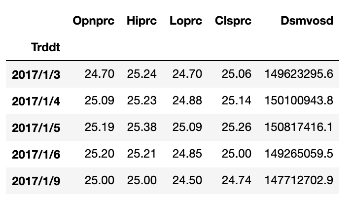
接下来就是把我们需要的数据取出来:
price1=data_input.loc[Ticker][start_time1:end_time1]['Clsprc'].values
vol1=data_input.loc[Ticker][start_time1:end_time1]['Dsmvosd'].values
dates1=data_input.loc[Ticker][start_time1:end_time1]['Clsprc'].index.values
dates1=pd.DatetimeIndex(dates1)
type(dates1)
用type()看一下发生了啥:
本来是numpy.ndarray
现在是pandas.core.indexes.datetimes.DatetimeIndex
现在我们得到的就是好看方便的日期了!
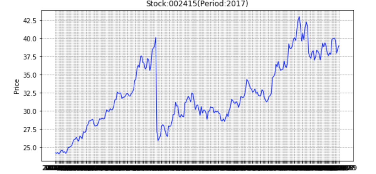
否则的话,你到时候直接画出来的图就会变成这样
Start plotting
其实我想说的就是神器subplot2grid,她可以任意排布图片
subplot2grid(shape, loc, rowspan=1, colspan=1)
shape : 画布的长,宽
loc : 这幅图在画布上的位置,也就是左上角的坐标的感觉
rowspan : 占多少行
colspan : 占多少列
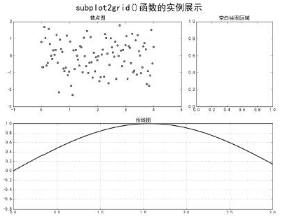
fig = plt.figure(figsize=(20,6))
ax1 = plt.subplot2grid((4,20),(0,0),rowspan=3,colspan=9)
ax1.set_title('Stock:002415(Period:2017)')
ax1.set_ylabel("Price")
ax1.plot(dates1,price1,color='blue',linewidth=1.0)
plt.grid(ls="--")

for label in ax1.xaxis.get_ticklabels():
    label.set_rotation(45)

ax2 = plt.subplot2grid((4,20),(3,0),colspan=9)
ax2.bar(dates1,vol1,color='midnightblue')
ax2.set_ylabel("Volume")
plt.grid(ls="--")

for label in ax2.xaxis.get_ticklabels():
    label.set_rotation(45)
解释一下,我的图是3:1的行数,1:1的列数,这样画完之后效果差不多这样: 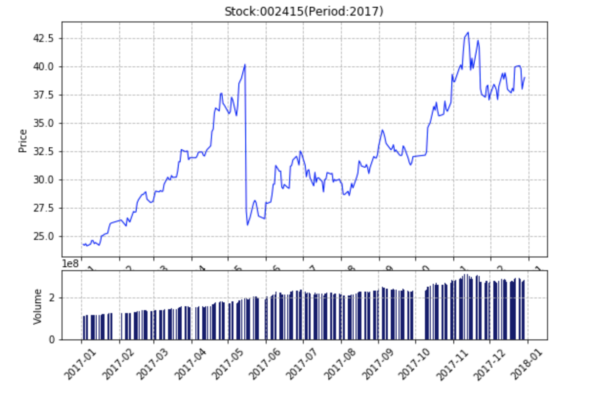
emmm,令人不悦,但是效果已经七七八八了,然后我当时又苦苦寻觅,发现了 下面的方法,简单说就是hspace可以控制subplots之间的间距,设置为0的话,就没有缝隙了:
plt.subplots_adjust(bottom=0.13,top=0.95,hspace=0)
left = 0.125 # the left side of the subplots of the figure
right = 0.9 # the right side of the subplots of the figure
bottom = 0.1 # the bottom of the subplots of the figure
top = 0.9 # the top of the subplots of the figure
wspace = 0.2 # the amount of width reserved for space between subplots
hspace = 0.2 # the amount of height reserved for space between subplots
反正有需求的可以上官网随便逛逛,matplotlib还是很强大
https://matplotlib.org/api/_as_gen/matplotlib.pyplot.subplots_adjust.html
完整代码
import datetime
from matplotlib.dates import MonthLocator, DateFormatter
import matplotlib.dates as mdates

price1=data_input.loc[Ticker][start_time1:end_time1]['Clsprc'].values
vol1=data_input.loc[Ticker][start_time1:end_time1]['Dsmvosd'].values
dates1=data_input.loc[Ticker][start_time1:end_time1]['Clsprc'].index.values
dates1=pd.DatetimeIndex(dates1)

price2=data_input.loc[Ticker][start_time2:end_time2]['Clsprc'].values
vol2=data_input.loc[Ticker][start_time2:end_time2]['Dsmvosd'].values
dates2=data_input.loc[Ticker][start_time2:end_time2]['Clsprc'].index.values
dates2=pd.DatetimeIndex(dates2)

fig = plt.figure(figsize=(20,6))
ax1 = plt.subplot2grid((4,20),(0,0),rowspan=3,colspan=9)
ax1.set_title('Stock:002415(Period:2017)')
ax1.set_ylabel("Price")
ax1.plot(dates1,price1,color='blue',linewidth=1.0)
plt.grid(ls="--")

ax1.xaxis.set_major_locator(mdates.MonthLocator())
ax1.xaxis.set_major_formatter(mdates.DateFormatter("%Y-%m"))
for label in ax1.xaxis.get_ticklabels():
    label.set_rotation(45)

ax2 = plt.subplot2grid((4,20),(3,0),colspan=9)
ax2.bar(dates1,vol1,color='midnightblue')
ax2.set_ylabel("Volume")
plt.grid(ls="--")

ax2.xaxis.set_major_locator(mdates.MonthLocator())
ax2.xaxis.set_major_formatter(mdates.DateFormatter("%Y-%m"))
for label in ax2.xaxis.get_ticklabels():
    label.set_rotation(45)

ax3 = plt.subplot2grid((4,20),(0,10),rowspan=3,colspan=9)
ax3.set_title("Stock:002415(Period:2018)")
ax3.set_ylabel("Price")
ax3.plot(dates2,price2,color='blue',linewidth=1.0)
plt.grid(ls="--")

ax3.xaxis.set_major_locator(mdates.MonthLocator())
ax3.xaxis.set_major_formatter(mdates.DateFormatter("%Y-%m"))
for label in ax3.xaxis.get_ticklabels():
    label.set_rotation(45)

ax4 = plt.subplot2grid((4,20),(3,10),colspan=9)
ax4.bar(dates2,vol2,color='midnightblue')
ax4.set_ylabel("Volume")

ax4.xaxis.set_major_locator(mdates.MonthLocator())
ax4.xaxis.set_major_formatter(mdates.DateFormatter("%Y-%m"))
for label in ax4.xaxis.get_ticklabels():
    label.set_rotation(45)


plt.subplots_adjust(bottom=0.13,top=0.95,hspace=0)
plt.legend(loc='best')
plt.grid(ls="--")

plt.show()

Yiting Li
Shanghai University of Finance and Economics